Dynamic Metric Trees: Improving Customer Profitability

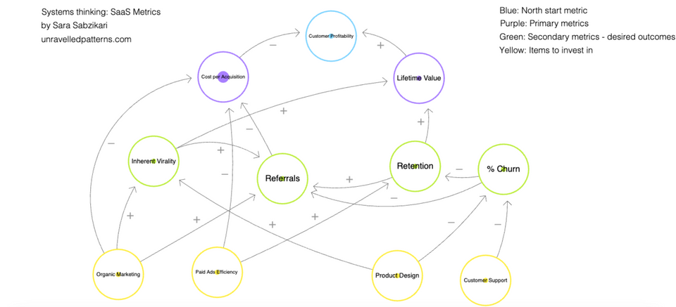
You will see an example of dynamic metric tree above built using Loopy. The metrics represent important components of a digital business and the lines between them indicate what types of relationships exist.
This is one simple way to visualise the underlying business logic of our north star metrics - especially for colleagues that sit in niche areas of the business and would benefit in knowing what the impact of their work can have on the profitability of the business.
The aim of this mapping exercise was to visualise where these obvious and not-so-obvious relationships exist. In doing so, I find the decision-making process is less reliant on intuition or guesses (which can lead to lower quality decisions), more on clearly defined logic and more likely to spot the second order consequences of decisions.
To use the interactive diagram, scroll down!
The Underlying Problem Solving Tool: Visualising Dynamic Systems
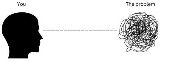
If you're not a business domain expert, intuitively recognising the relationship between a single metric and the entire business is not very easy. Businesses are complex systems - and with complex systems comes more brain fog. Good news; visualisation can demystify these larger and more complex systems, from businesses to engineering systems.

Data analysts often become very familiar with various parts of the business as they rotate between different business problems. We develop a mental metric tree that we apply somewhat intuitively. I've found it can also be quite valuable for other colleagues to visualise these mental metric diagrams. That's because metric trees are a great way of demonstrating the second order consequences of a single change across the whole business.
When we attempt to intuitively navigate a complex system, it is likely that we'll run into some thinking gaps that cause inaccuracies or assumptions - these are flaws in our problem solving process that leads to seeing gaps when there are connections. You might recognise experiencing some of the ones listed below:
- Making decisions with a limited understanding what the entire system looks like beyond the point of interest
- Adopting linear thinking (most systems aren't linear)
- Neglecting second order consequences of an activity or decision.
I find that by focusing on the first point, you'll probably mitigate the other two from happening. The main benefit to visualising these complex systems is that it helps improve the decision making process.
So how does one build a more comprehensive understanding of an entire system? Structural thinking. This involves directing your focus to probable causal relationships - i.e. which elements of the system produce the observed behaviour we're looking for?
Case study: Customer Profitability
In a business setting, metrics help us monitor our performance and productivity. We can visualise the underlying logic that impacts the primary and the north star metrics using dynamic metric trees - diagrams where metrics are organised in a hierarchical or structured manner to helps identify the underlying logic that impacts the metrics that sit above them.
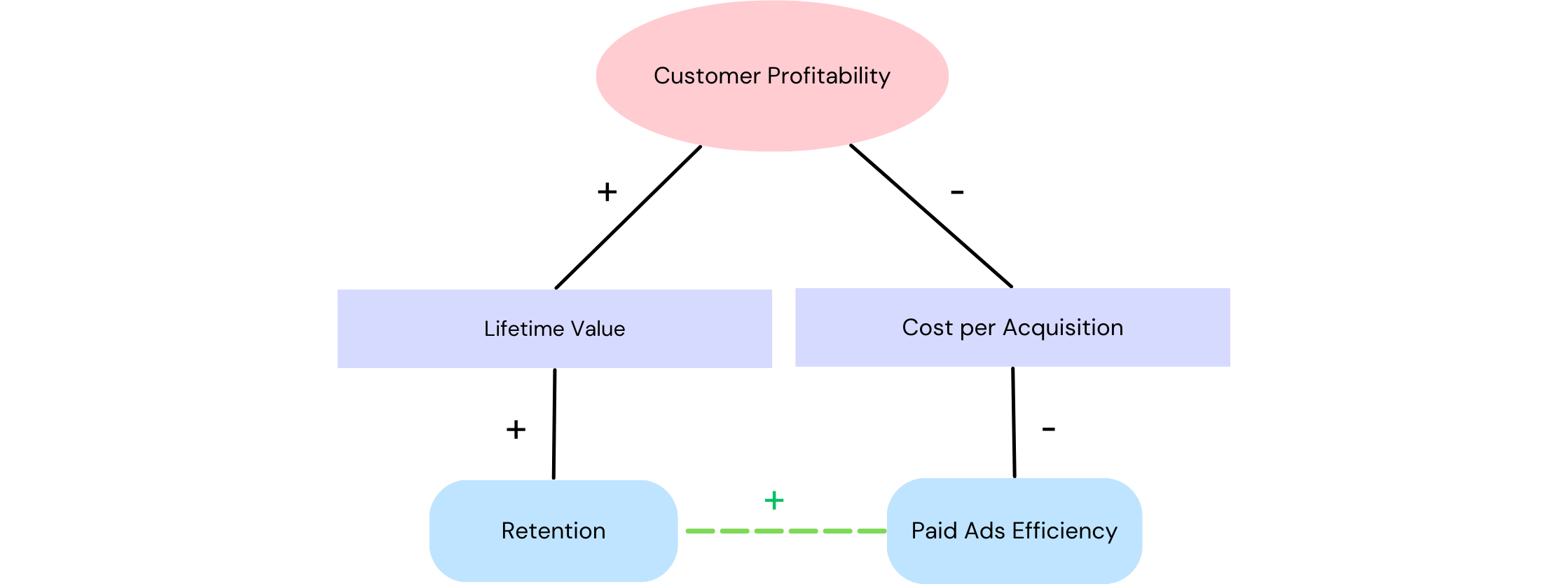
For example, if we want to understand customer profitability, lets focus our attention on what we know - profit comes from the customers. More specifically, profit is derived from the amount of customers we obtain, the length of time they stay with the business, minus the cost to acquire them.
We've identified our two core metrics that influence customer profitability; customer lifetime value and customer acquisition costs. Take each of these core metrics, ask the same questions, and see what other causal relationships exist deeper into the system.

You'll soon start to think beyond obvious causal relationships, and understand the small but still significant linkings between the elements of the system. For example, if done well, paid marketing strategies can bring in the right type of users to your application. These users may recognise the value proposition of your product to a greater degree than a broad audience, and therefore stay longer - increasing the average lifetime of a user. But this relationship isn't immediately obvious.
How to use the dynamic metric tree
- Observe each metric on the canvas and the hierarchy defined by the colours.
- Start with the north star metric (blue). Move down to the primary metrics (blue) and experiment with clicking the upward and downward arrows to introduce the element into the system.
- Observe the changes that occur at the top and throughout the web - consider the high level strategies that could be used to lift the blue bubble.
- Next look at the secondary metrics (green) - these are the underlying logic that impacts the primary metrics. By clicking the arrows for each metric, see how we can influence the underlying logic that impacts the purple.
- Keep moving down onto the yellow metrics - these are our initial areas of focus or business investment. Click on the arrows as above. If there was more space on the canvas, these yellow bubbles would have lower level metrics to follow too.
You can see how combinations of different metrics can be complementary or contradictory, or if the system is complex enough, both!
A limitation of this model is that by simplifying the system, it's hard to integrate more nuanced business logic. While this will always be the case when visualising complexity, it's a great first step in minimising the occurrence of thinking gaps.
Access the dynamic diagram via this link!
Thank you for reading! I have fun writing these, and I hope you get to experience some of the joy too.
